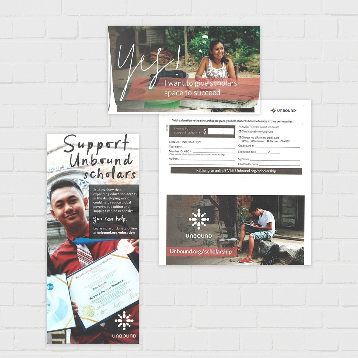


Unbound sent to sponsors and included as a ride-along in publications to boost Unbound's scholarship program. We always used real scholars' stories and images to show sponsors that the fund was impacting young adults' lives.

I designed an online version of Unbound’s flagship publication, Living Unbound. Unbound’s reporters captured such rich content that we saw this as an opportunity to immerse users in video and audio from around the world, making more personal connections with the excellent work in the field.

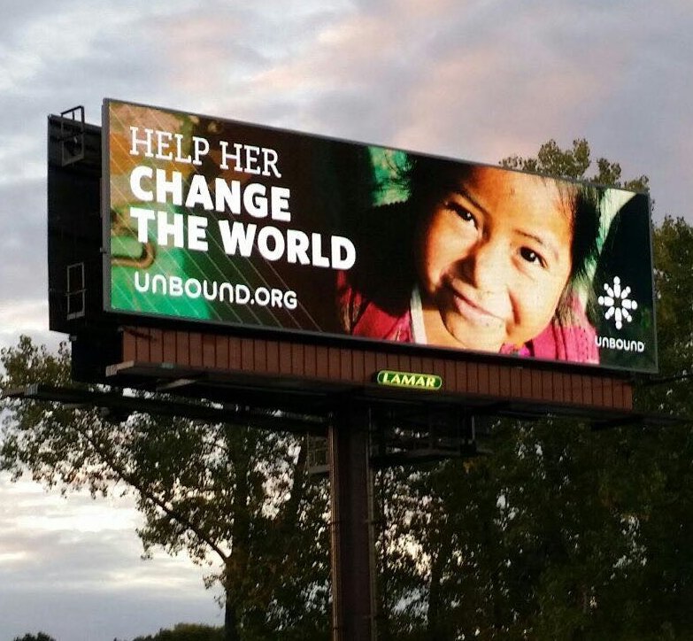
Promoting a charity or nonprofit’s work can be challenging due to the complexity of programs and methods. But in a billboard, you have a few seconds to pique interest and say what’s needed. This simple message and smiling face increased web traffic in the Kansas City area.

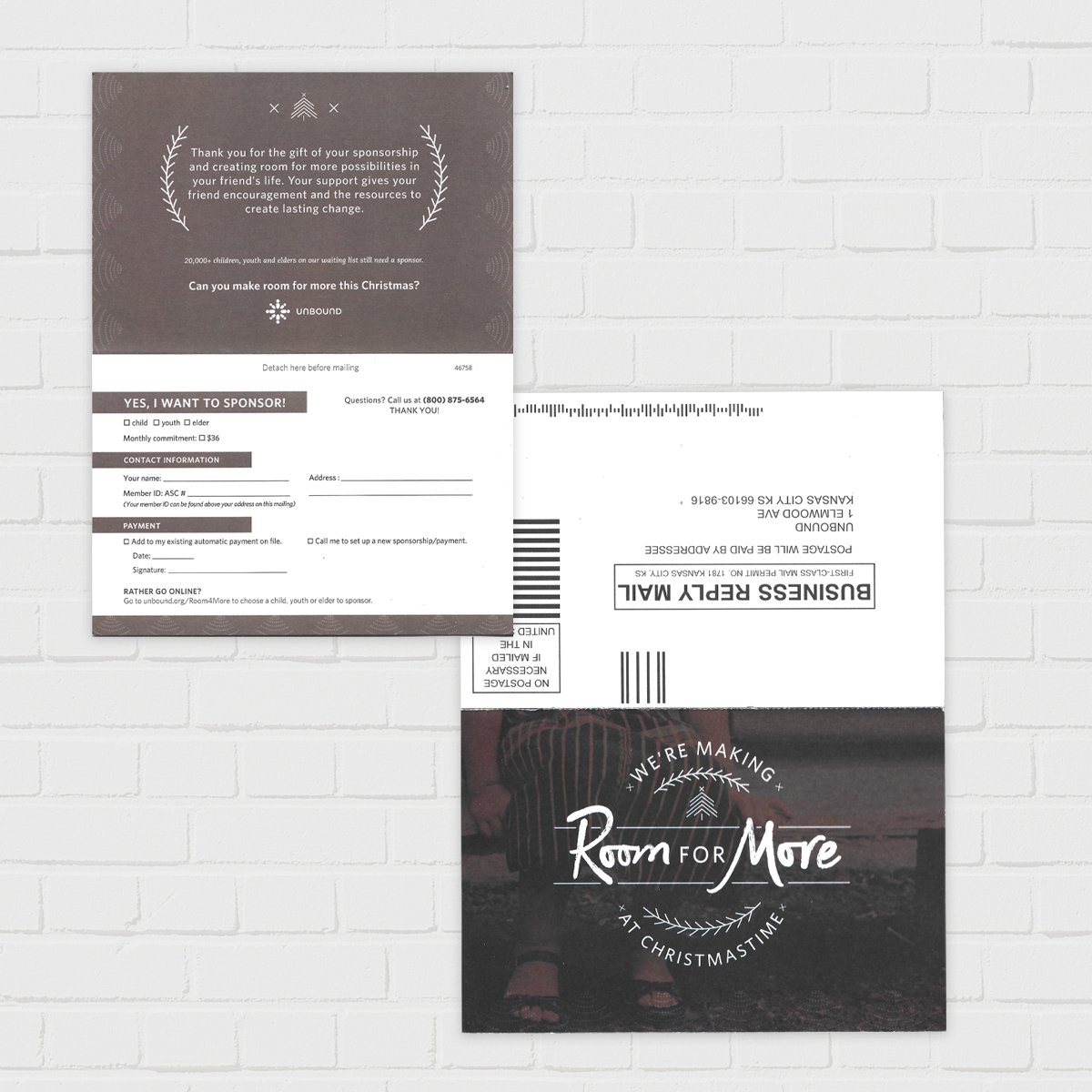
I art directed this “Room for More” seasonal campaign for Unbound, based on the Swedish concept of hygge. I provided shot lists, video guidelines and art direction surrounding the campaign. You can see the campaign video here: https://vimeo.com/299321438

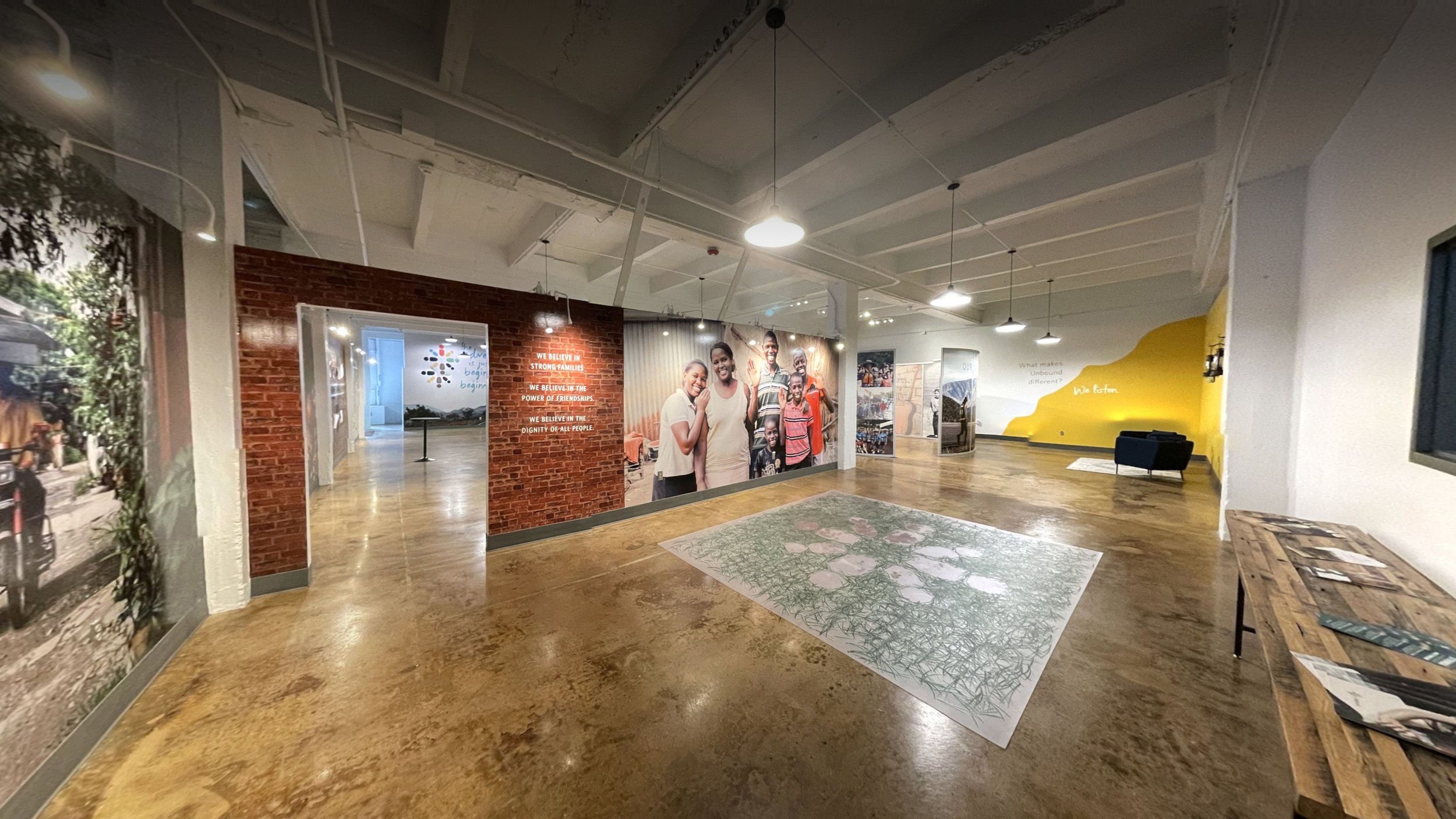
I designed this multiple thousand square foot visitor experience in the warehouse of Unbound’s headquarters. It features huge wall graphics, 3D features, soundscapes, floor graphics, and curated artifacts. I wrote the exhibition script with collaborators from marketing and editorial departments, found and displayed artifacts, installed many graphics and features, and edited soundscapes.

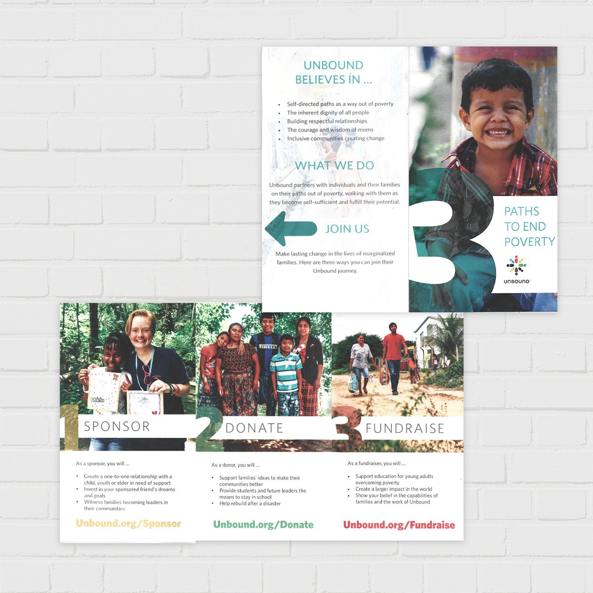
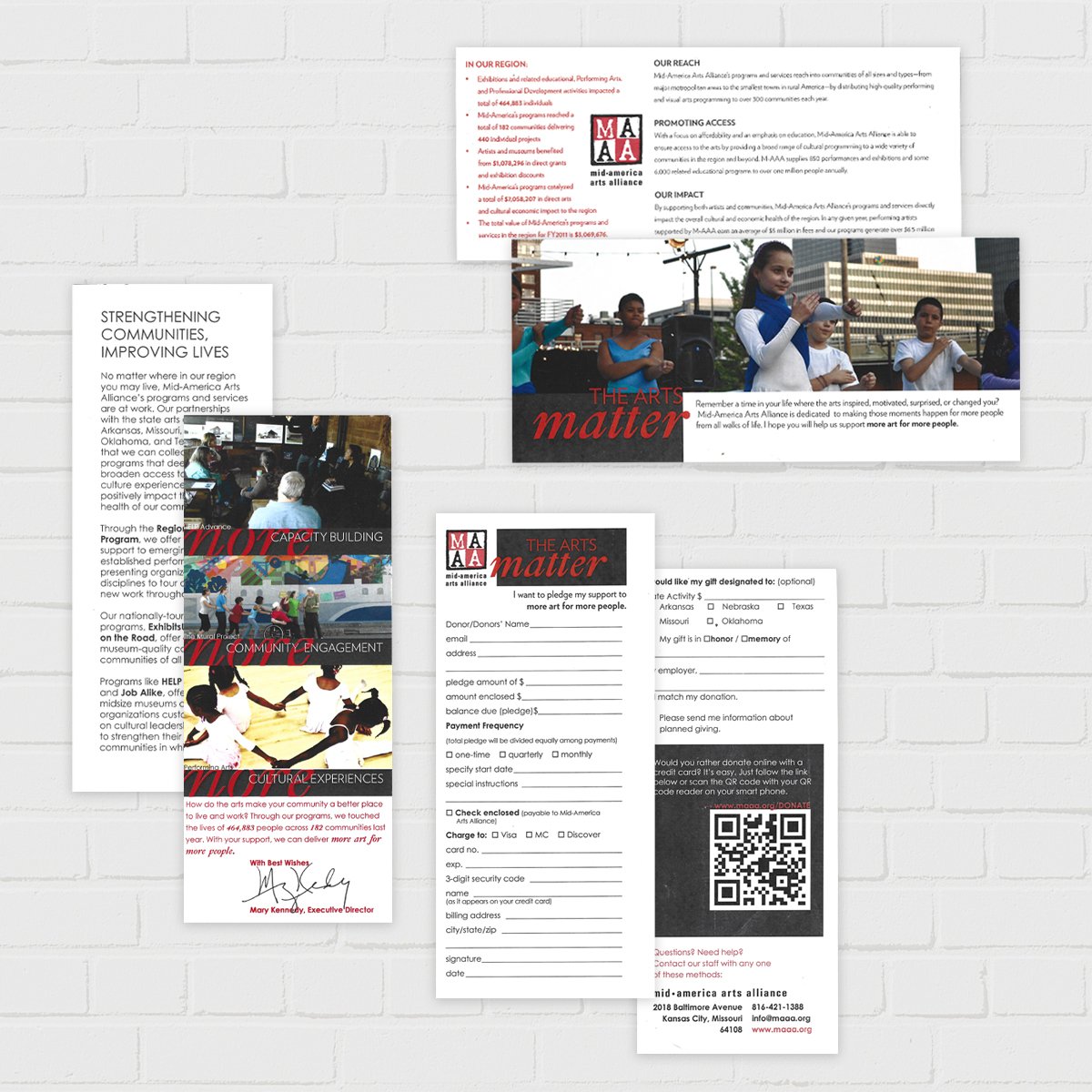
Again, sometimes explaining to potential supporters how to get involved or what their support accomplishes can be complicated. This piece was designed to make getting involved simple and easy.

This video was made to celebrate Mid-America Arts Alliance’s 40th year, give a brief history lesson, and soft-launch M-AAA’s new logo design (by me).

A labor of love, this logo was launched at M-AAA’s 40th anniversary and headquarters reopening. I started with research and focus groups and worked on drafts until the new identity made sense for M-AAA’s goals.

At M-AAA, I usually worked with a small budget. So I utilized our in-house printer and paper cutter and took promotional shots of our programs with our little Nikon camera. These small direct mailers were cost efficient and had big impact for raising funds.

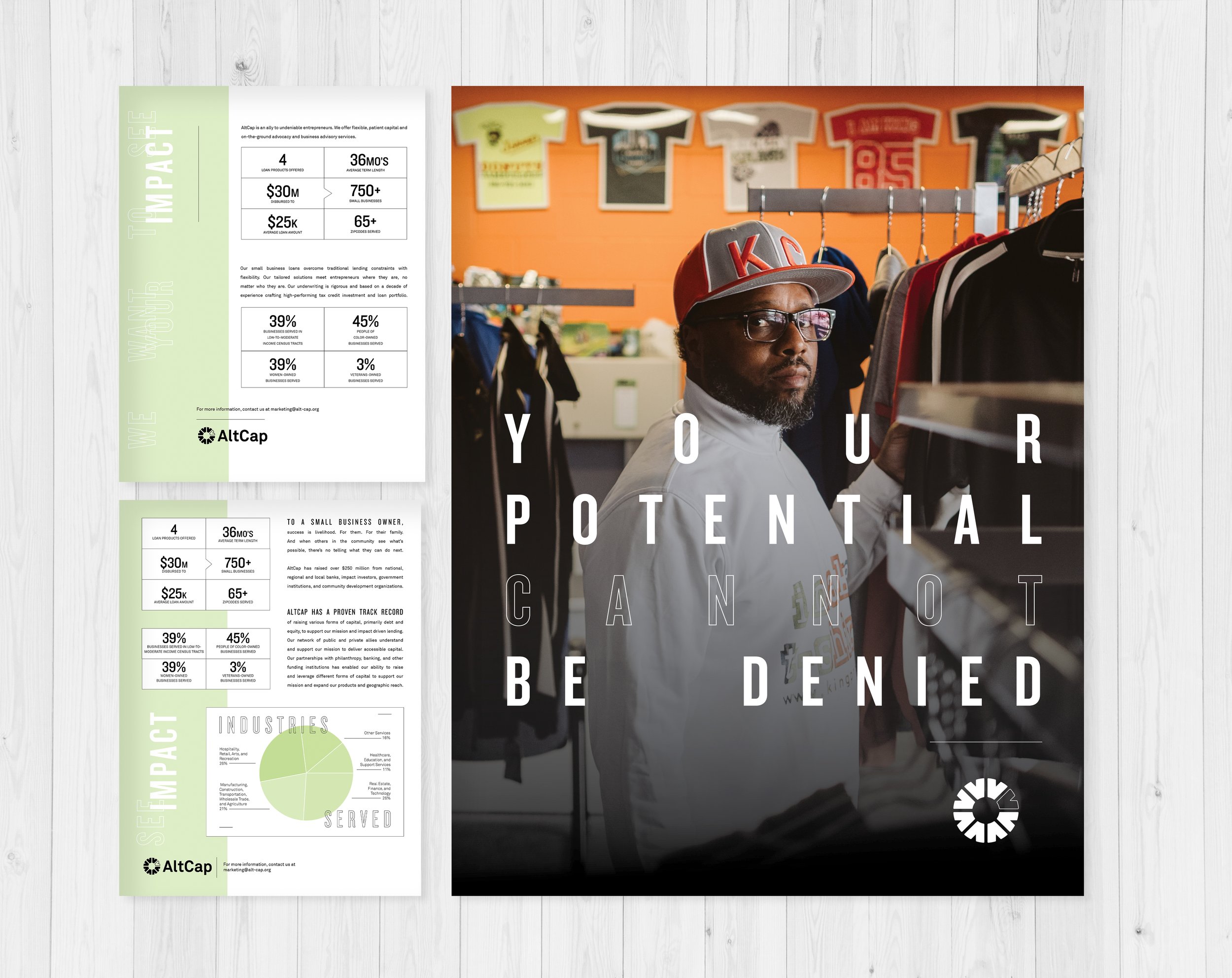
I created two versions of this document, one for investors or potential partners, and one for potential applicants. It shows straight forward data on the impact AltCap makes for business owners and communities.

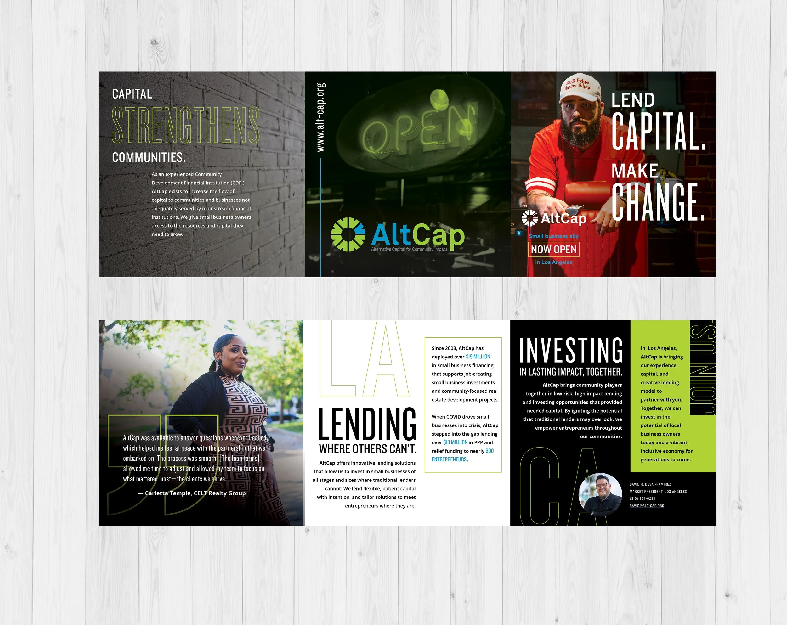
This brochure introduces AltCap to new cities like Houston and Los Angeles. The focus is on strengthening communities through getting capital to entrepreneurs within those communities.

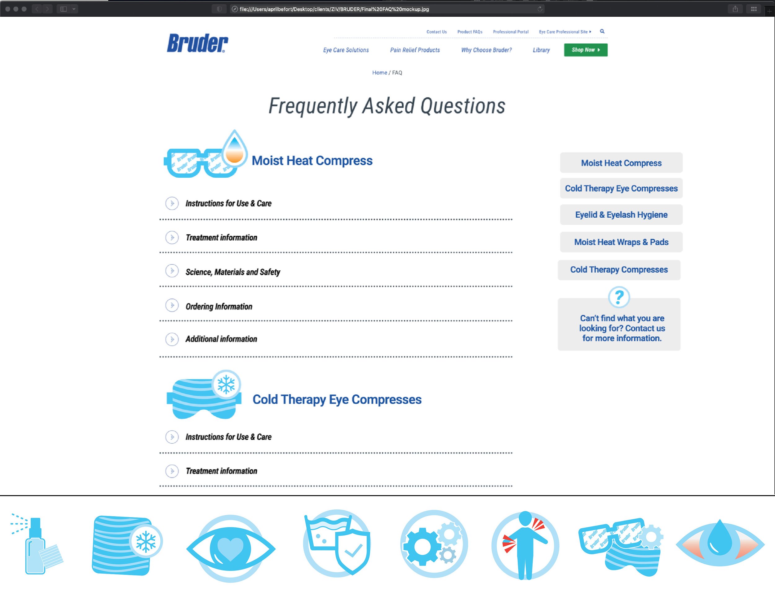
This is not nonprofit work, but I wanted to demonstrate UX design. This page was a hodge podge of questions from customer service representatives. It was reactionary to phone calls received by customer service. This redesign provided a more comprehensive, highly organized, and easy-to-use solution for a FAQ page.
