




I have known one of the owners of Gloss Rx my entire life, so I totally understood her aesthetic: high-end, classy and classic, chic. I immediately was drawn to a look that reminded me of Harper’s Bazaar, Vogue, or Elle. The owners of Gloss Rx also wanted fun messaging that uplifts.

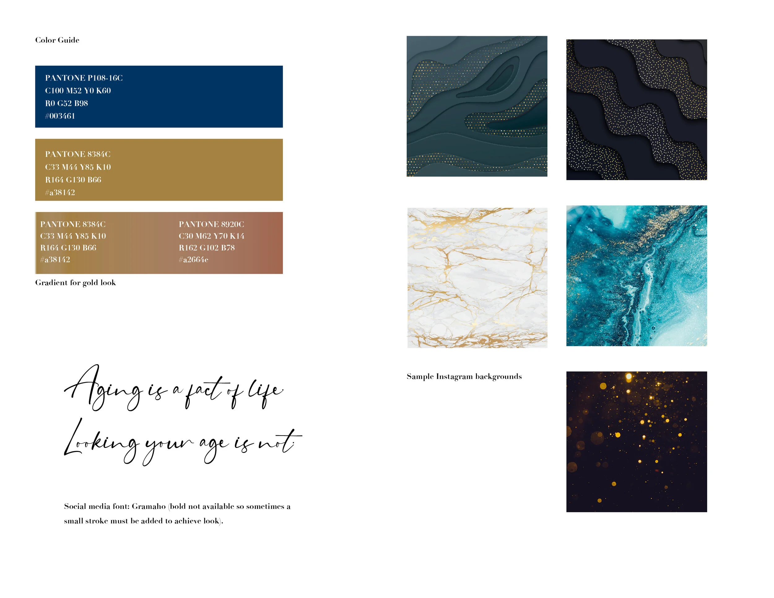
I put together a tool box with a basic color palette, elegent fonts and sparkly backgrounds so that they could create content for their brand on social media.

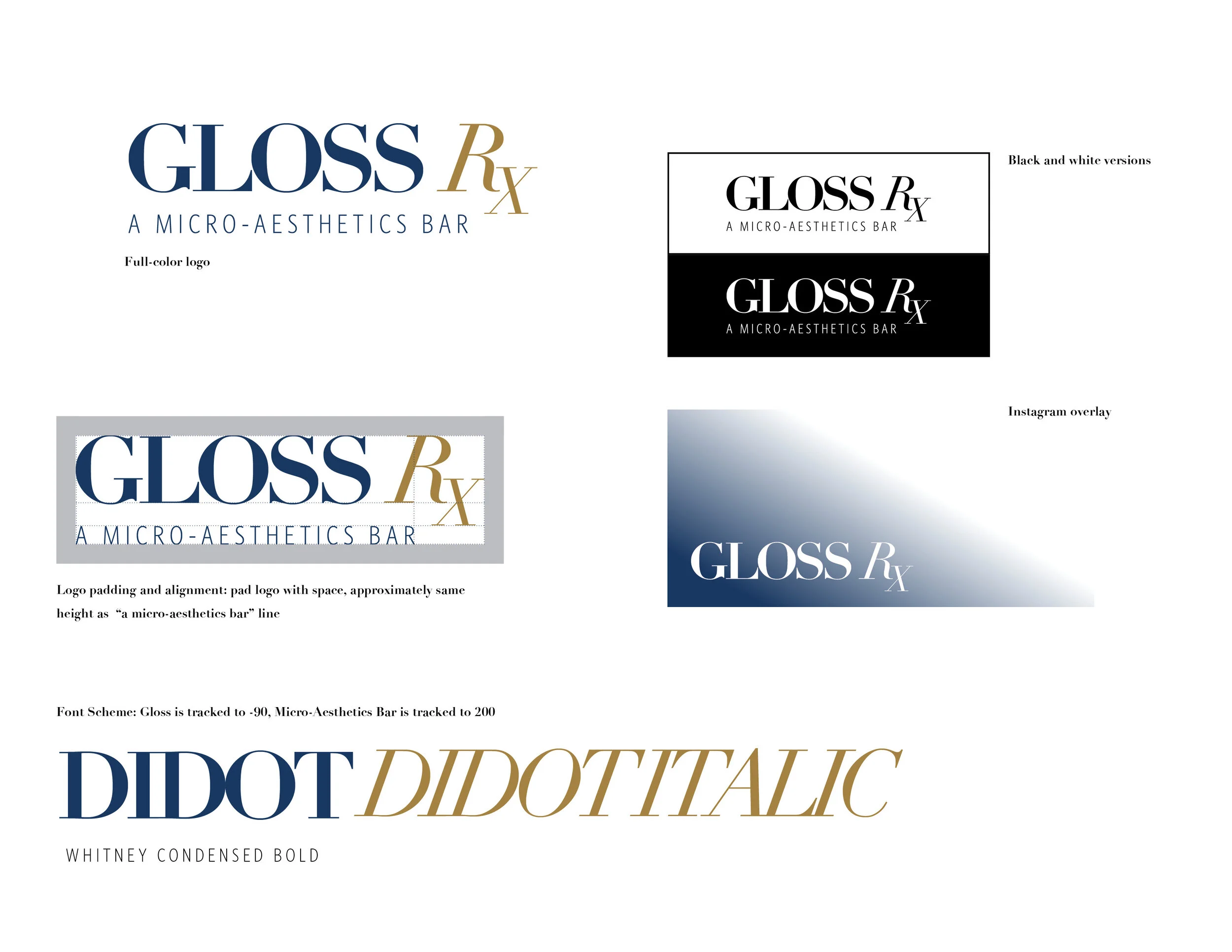
I wanted Gloss Rx to have a good understanding on how the logo is spaced and what fonts are used. I provided them with some basic advice on spacing and how to use the reverse and black logos as well.

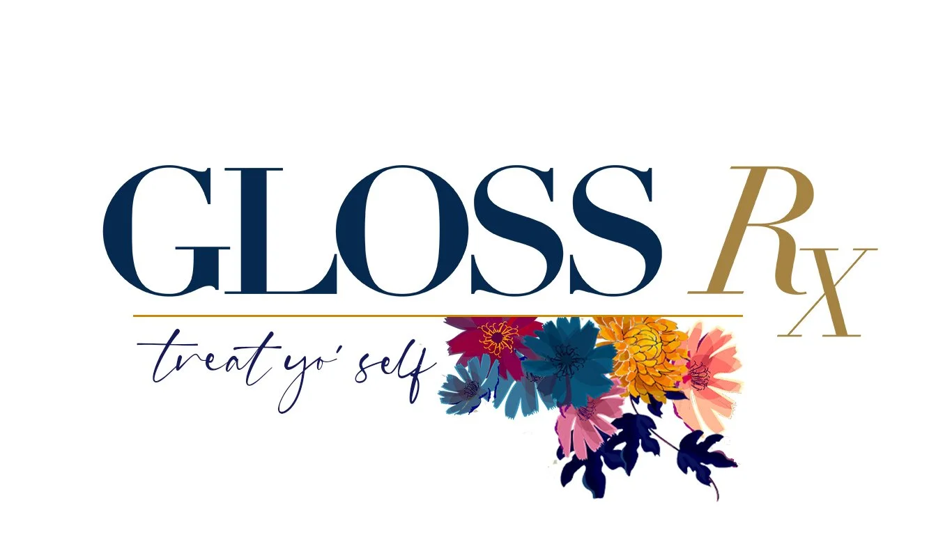
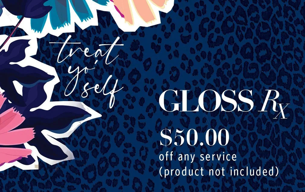
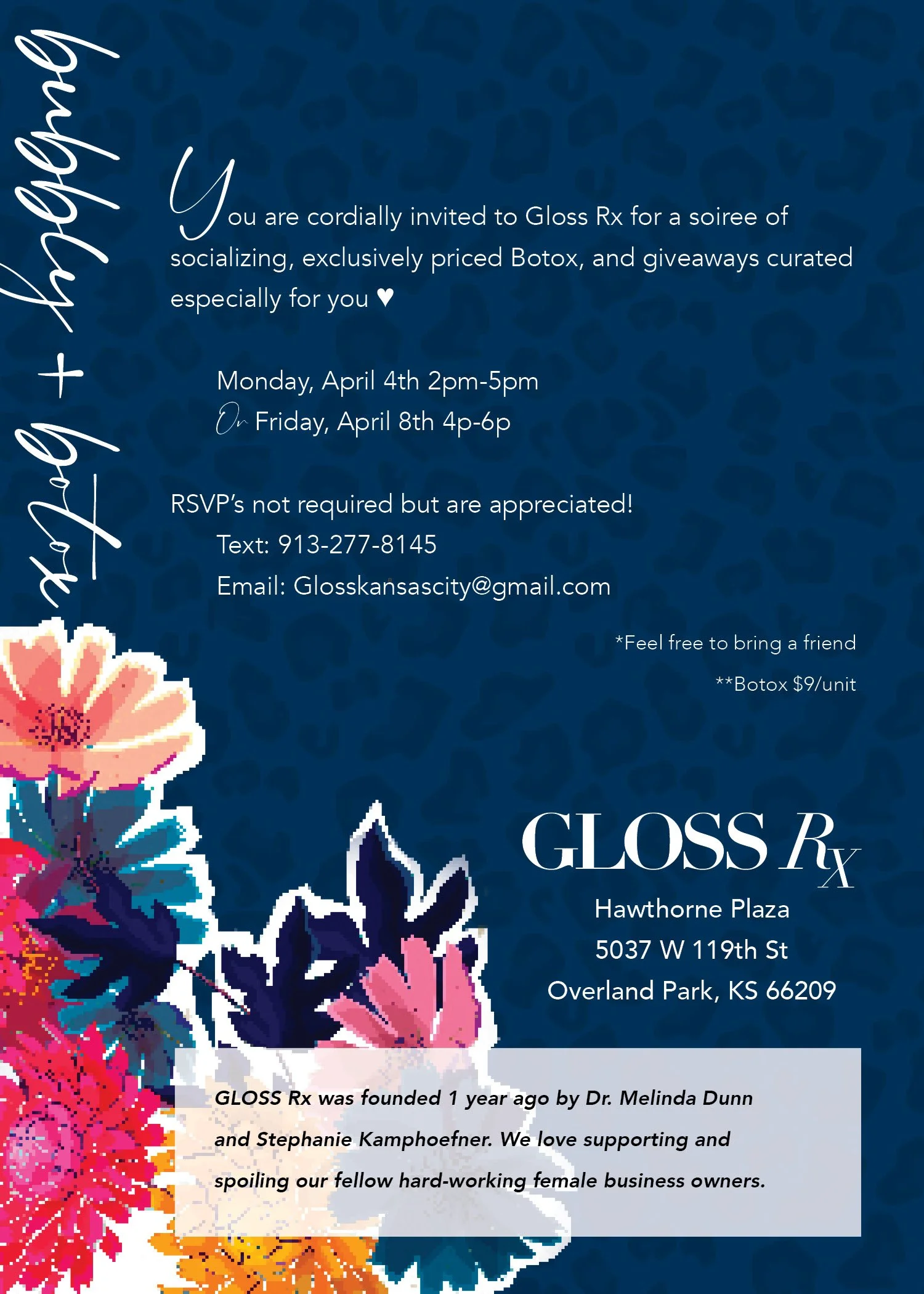
This graphic was used in multiple ways for gift giving, such as an envelope for a gift card and social media. I created the floral pattern right before spring hit, and injected some oranges and magentas to bring some much needed color after a long winter.

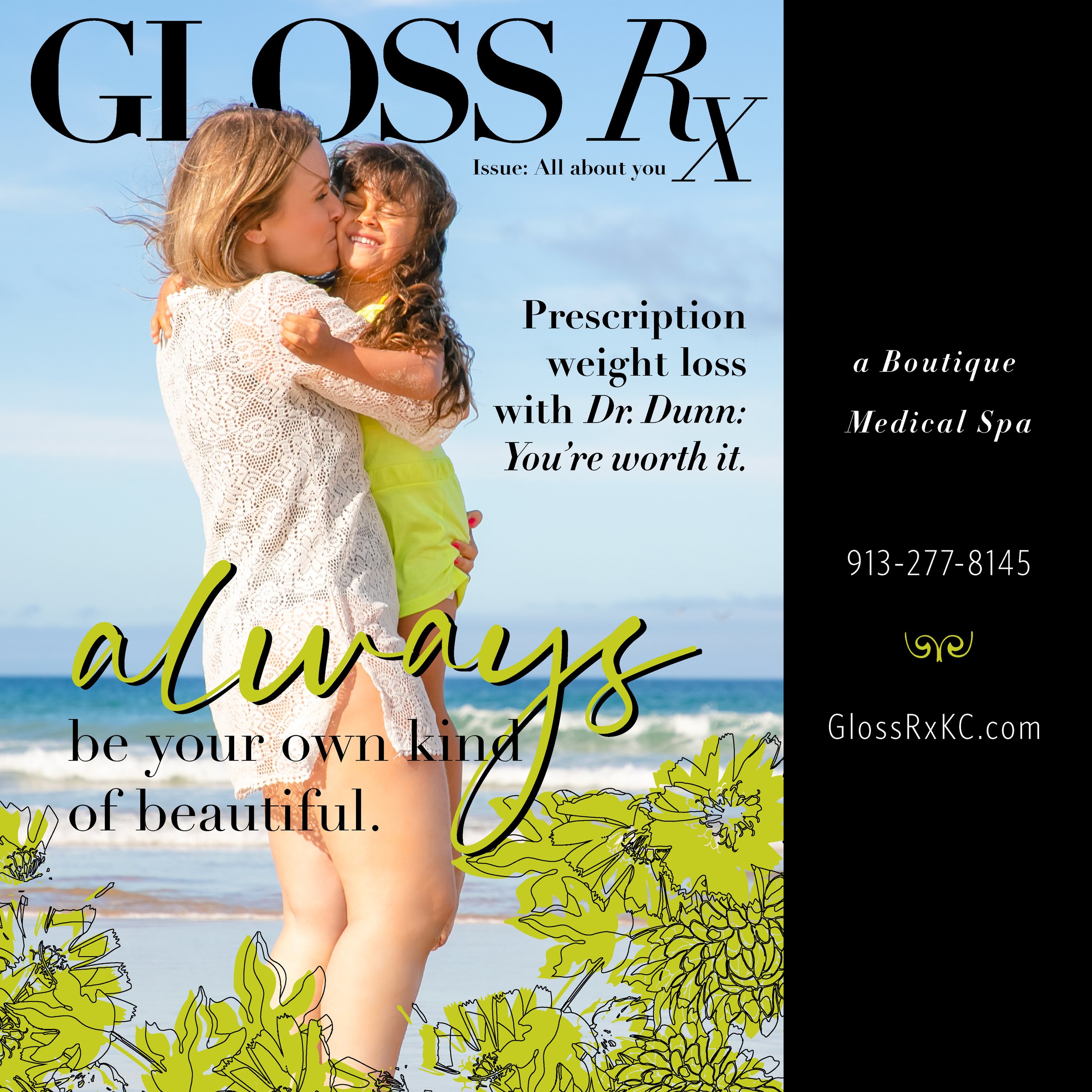
This is an ad for instagram for weight loss solutions. I used layers to just give a hint of a physique.

It’s not real until there’s a sign! This is Gloss Rx signage installed at the shop at Hawthorne Plaza in Leawood, Kansas.

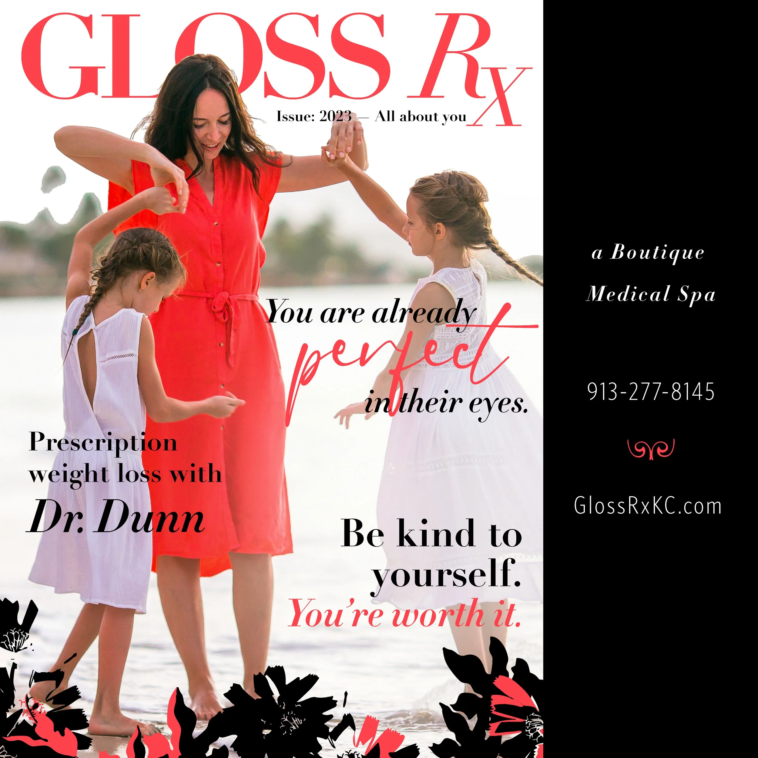
Going back to the original inspiration for Gloss’ brand, I created this ad to look like a fashion magazine. And, I love the positive messaging.
