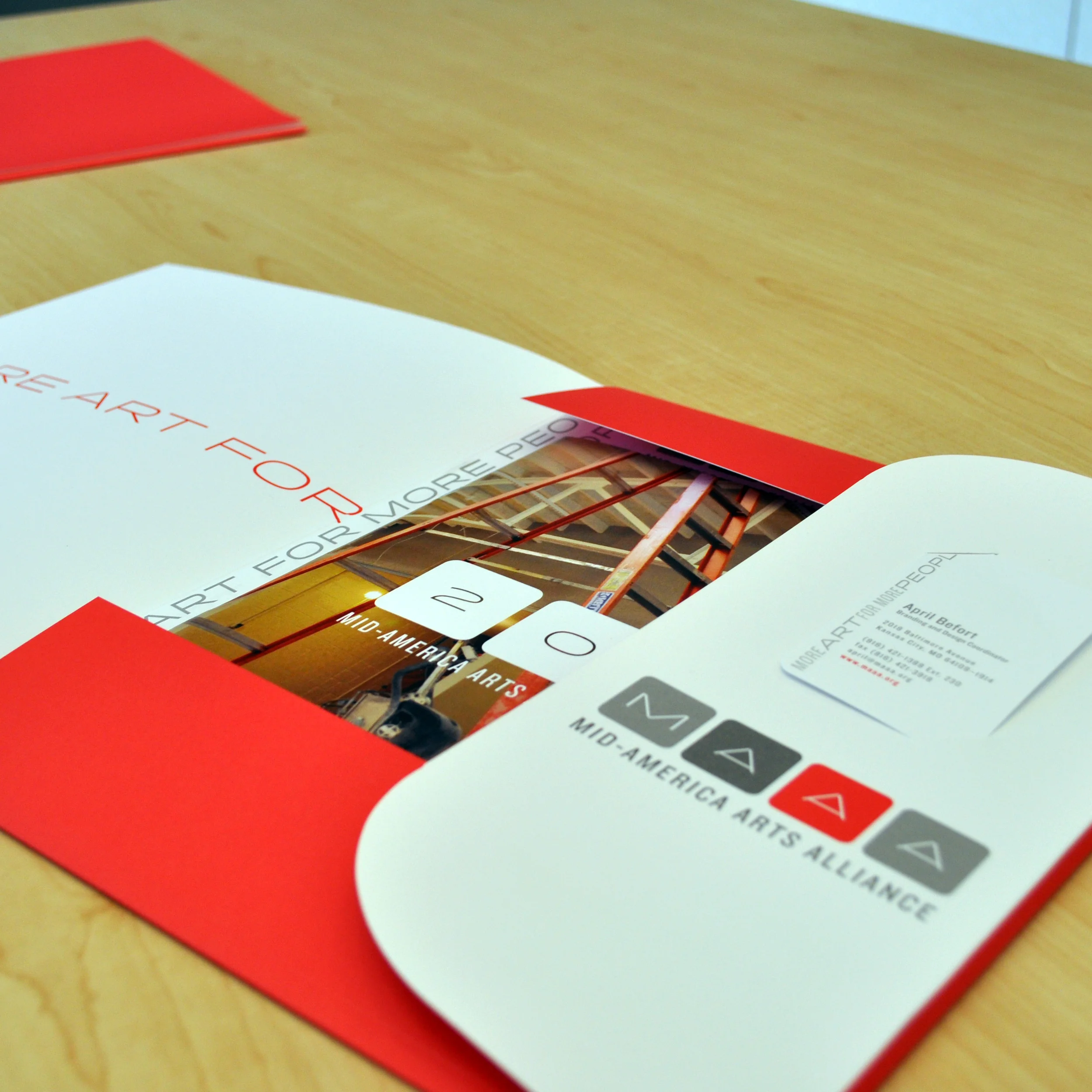
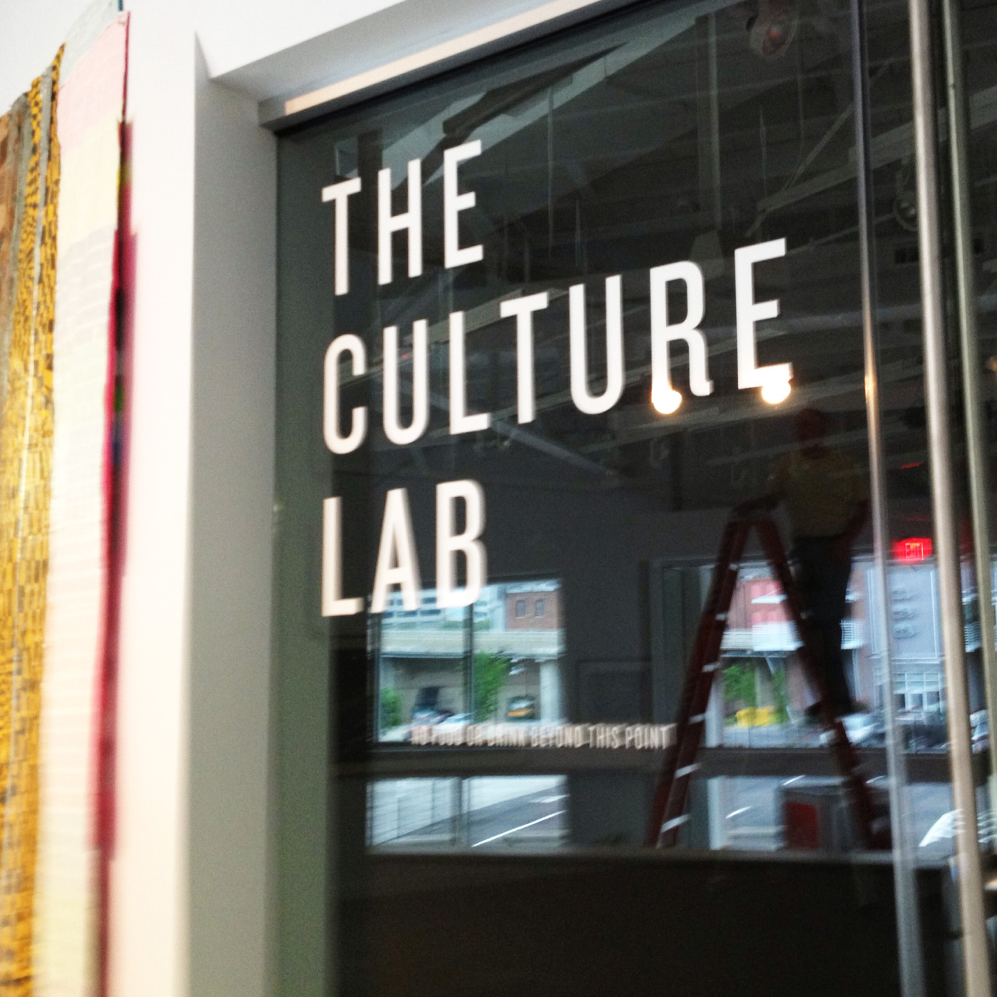

The new design for Mid-America Arts Alliance’s (M-AAA) headquarters was heavily influenced my mid-century design. ‘Mad Men’ was on and I also worked on a Frank LLoyd Wright exhibition, so the love for all things Mid-Mod was at a peak. I fell in love with these fonts from what was then Hoefler & Frere Jones foundry.

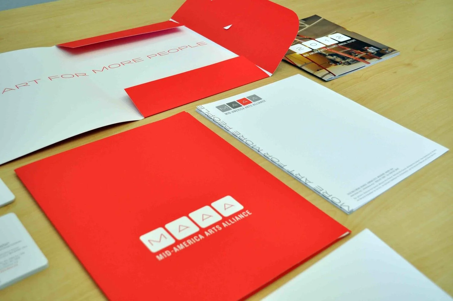
I loved updating M-AAA’s color palette from black, tan and cherry red, to these warm rich grays and the eye-popping orange red.

I had to redesign quite literally everything, once a new identity was approved. Letterhead, business cards, hundreds of forms and reports, websites, social medie, even signage. It was indeed a gauntlet of work, but the results were worth it.

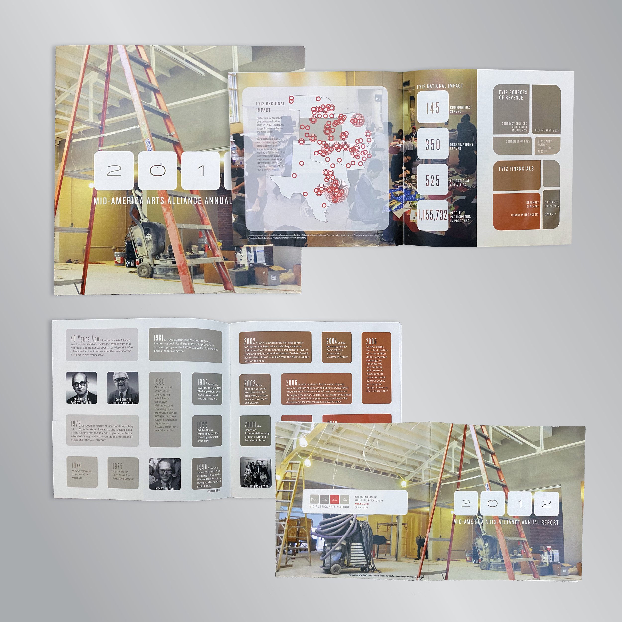
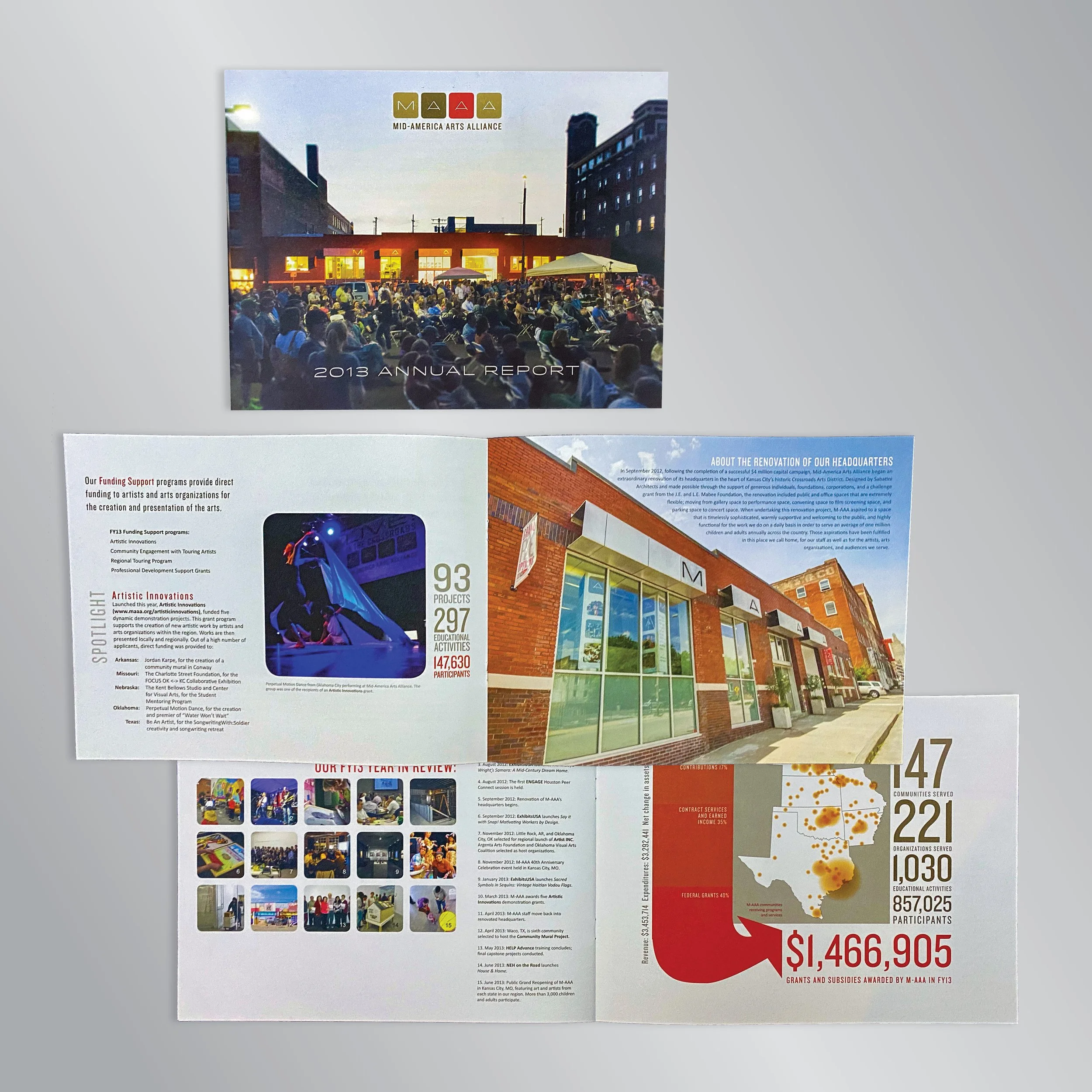
This annual report came out right before M-AAA’s new headquarters was opened and during it’s 40th anniversary celebration. The design shows the history, but also what’s to come. I had a lot of freedom to present information in new ways and break free from traditional layouts.

With this annual report, I designed it so that you could see some amazing images and read about each program, or you could glance at the impact numbers and flip through. The concept was about M-AAA coming into it’s own.

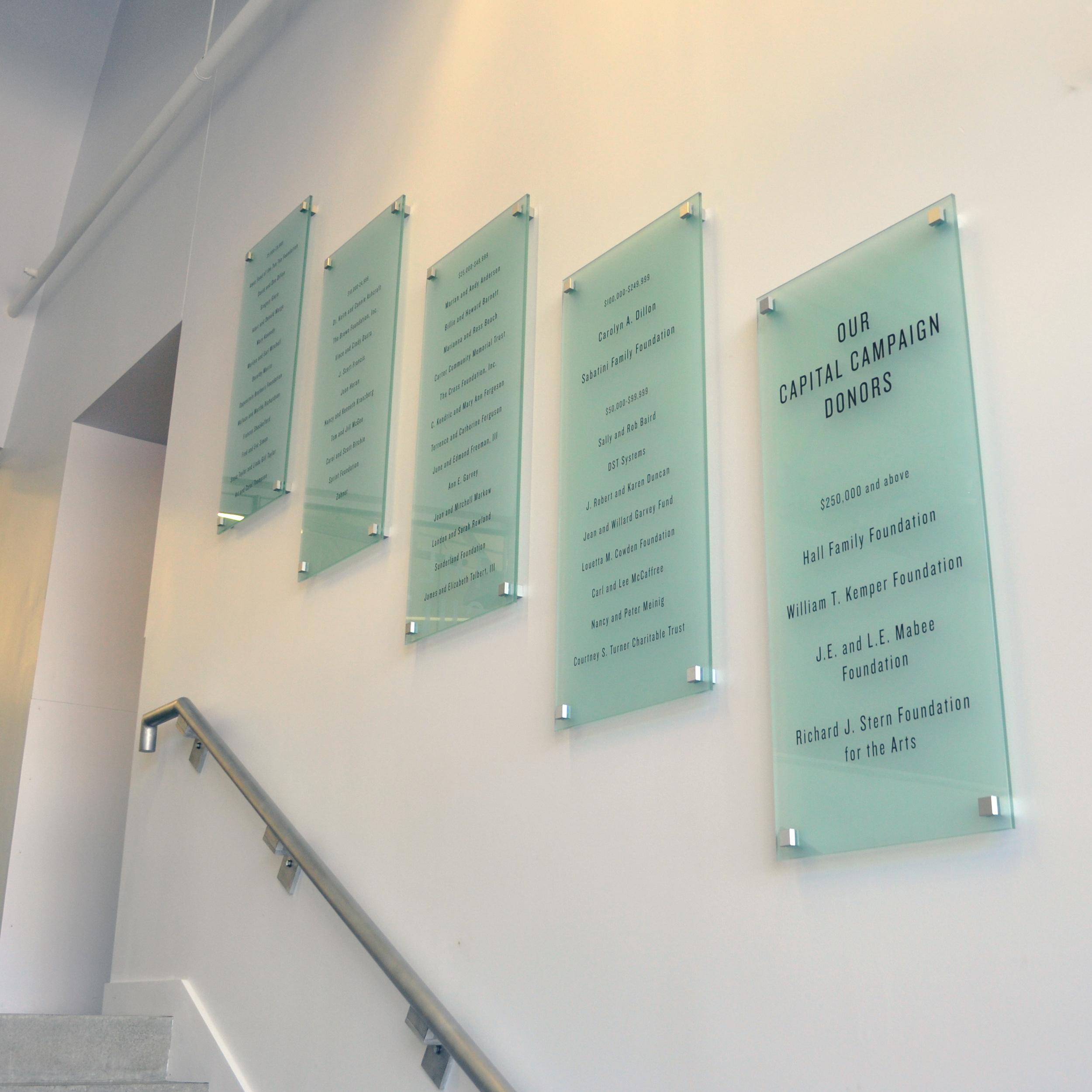
The glass in this wall has silver vinyl lettering applied to honor donors. I worked with Midtown Signs on a concept that looks permanent and premium, but is actually easy to update with new names by simply applying new vinyl to the glass.

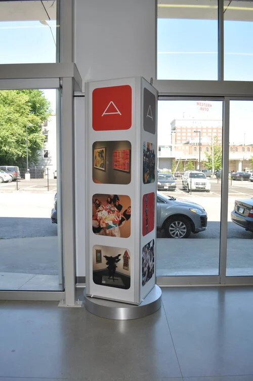
It looks substantial, but this tower is actually portable. The walls are made from dye sub fabric inserted into a channels. This makes for easy updating. Simply reprint the fabric and it mails in a small envelope. It turns so in the center of the room it can showcase multiple images, or when in a corner it can be angled to focus on one set of images.

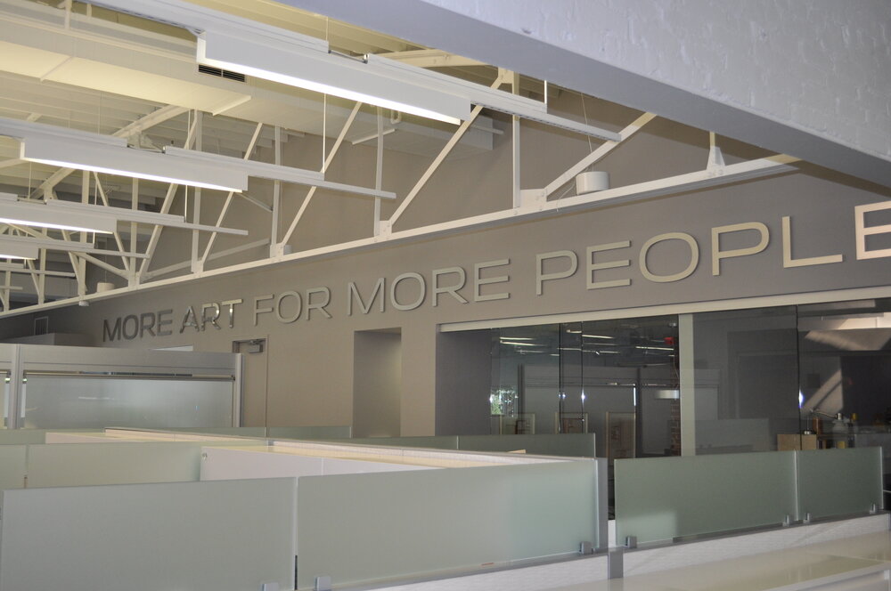
I had this installed across the long wall in the newly renovated headquarters, because at it’s heart, that’s what M-AAA is all about.

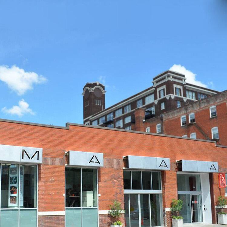
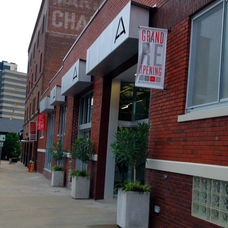
I worked with Midtown Signs to design this backlit metal signage for M-AAA’s headquarters.

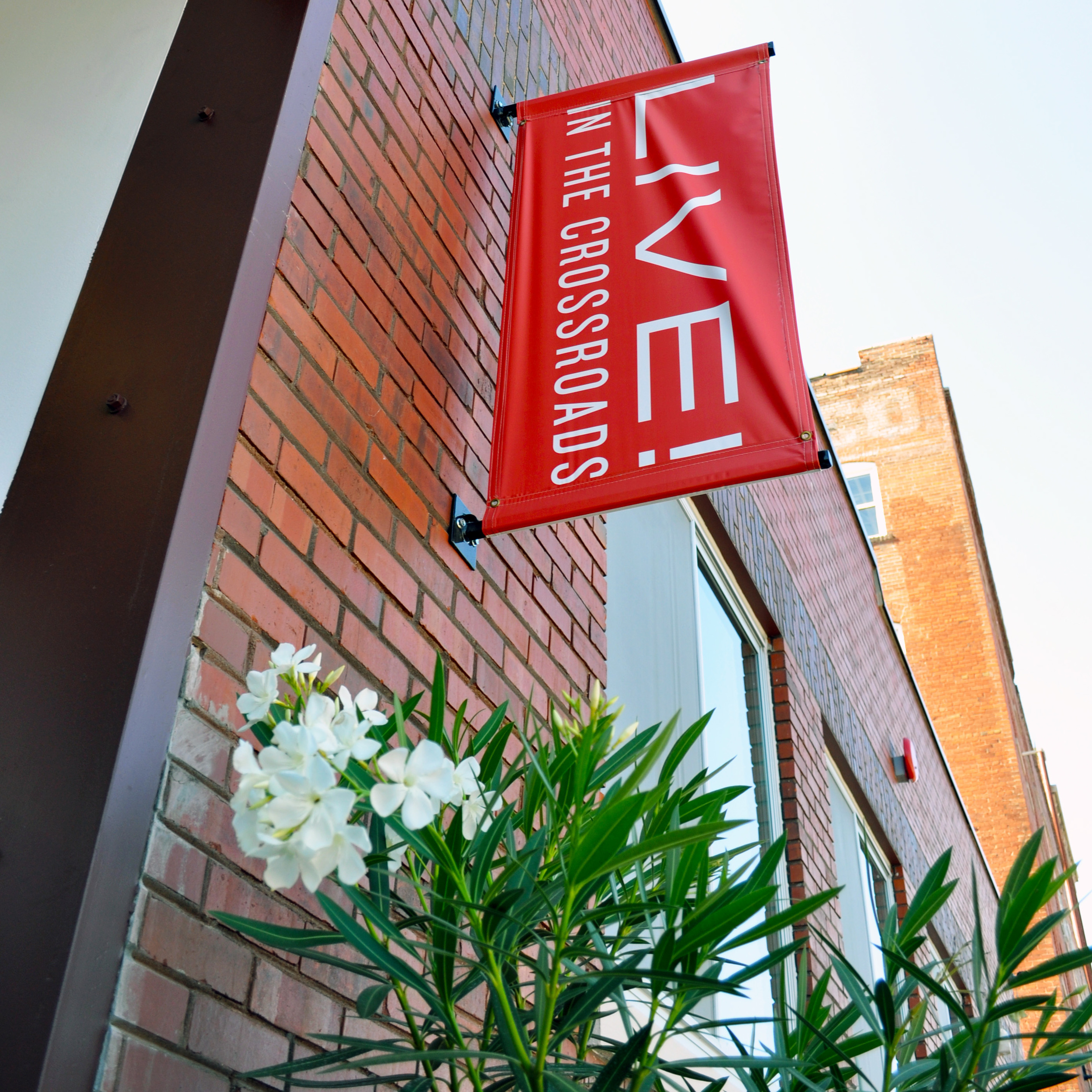
The great thing about these flags is that the street M-AAA resides on is in the heart of the Crossroads in Kansas City with a ton of foot traffic. So, a lot of people see them, and it is cost effective and easy to change out the messaging. For example, this one is advertising the summer concert series held in the parking lot of M-AAA.

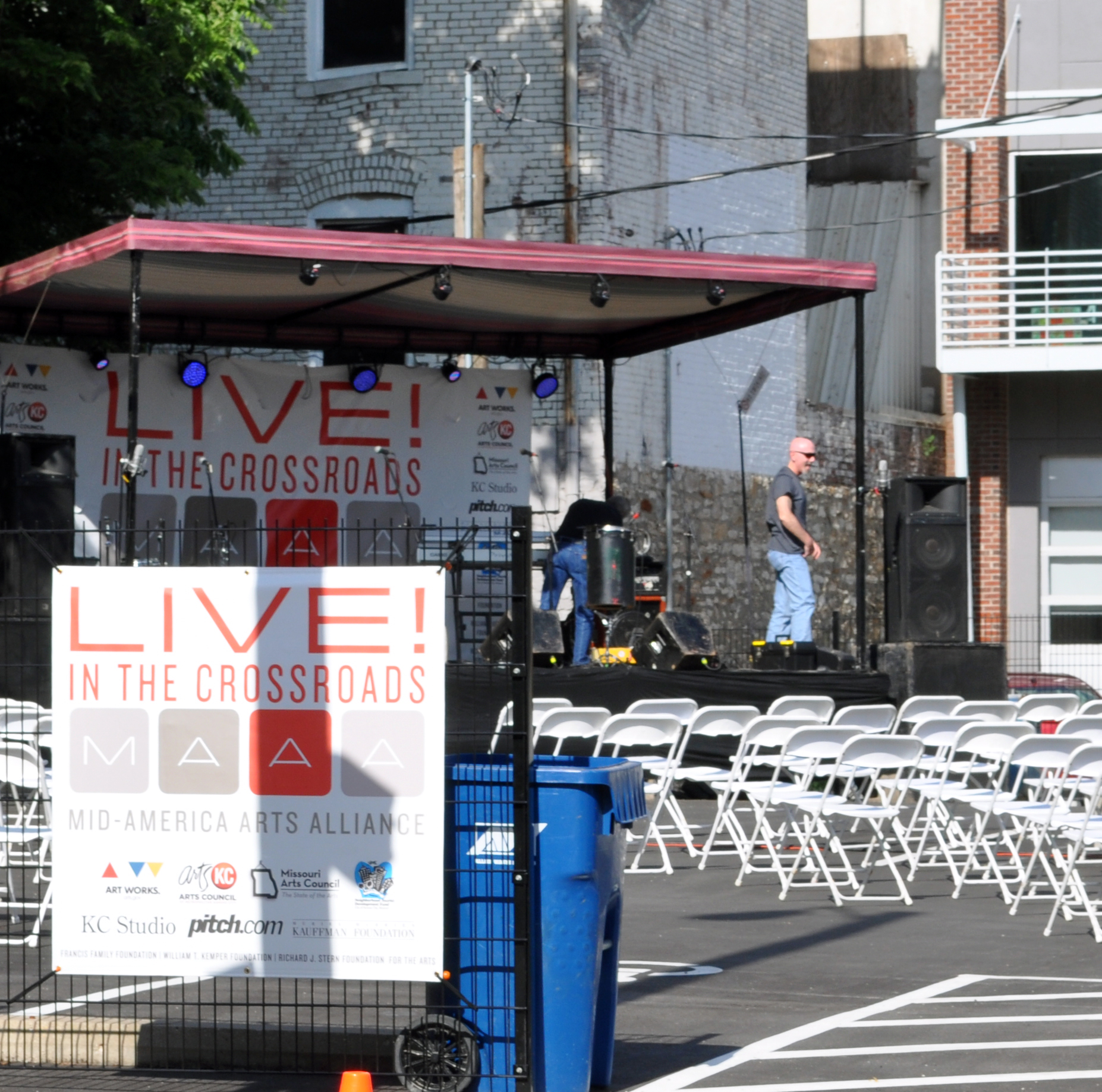
Every summer, M-AAA has a concert series in the middle of the Crossroads during Kansas City’s famous art walk on first Fridays. I designed branded tents, signs for stage and along entrances, handouts, and giveaways like fans or T-shirts.

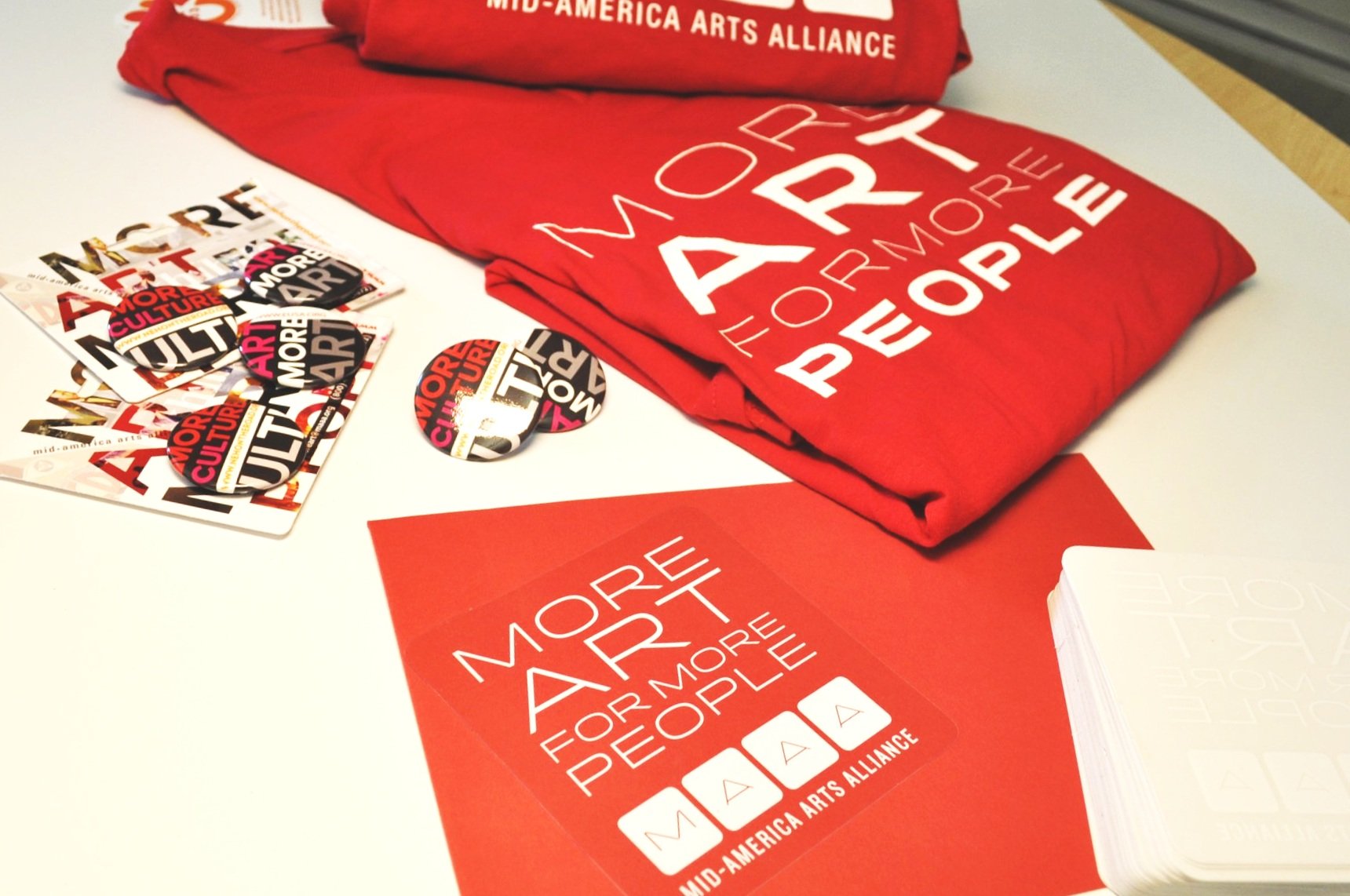
I designed this branded merchandise to be sold as a fundraiser or given away at M-AAA events.

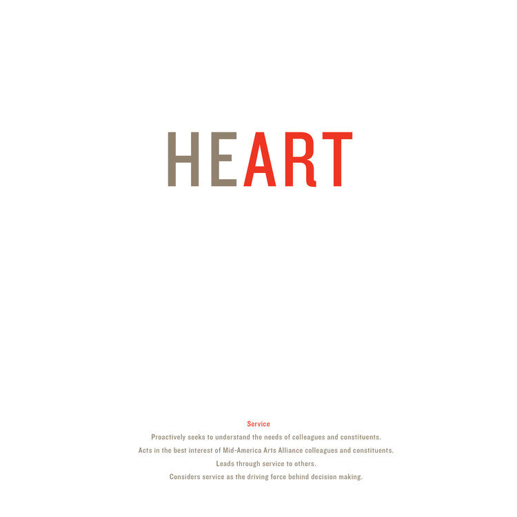
I created posters to showcase M-AAA’s core values throughout it’s newly renovated headquarters.

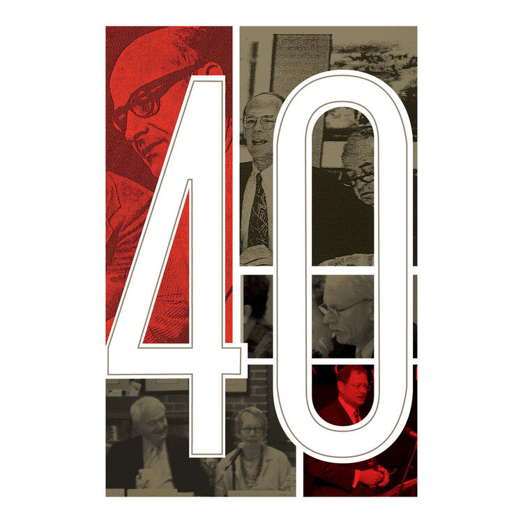
I created this design with several of M-AAA’s founders to honor their 40 years of successful arts programming.

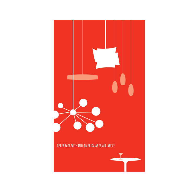
I created graphics of actual lighting found in M-AAA’s headquarters, and again, was able to bring mid-century design in a bold way.

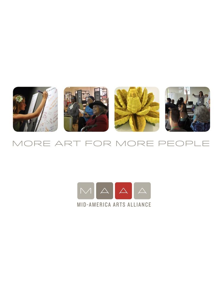
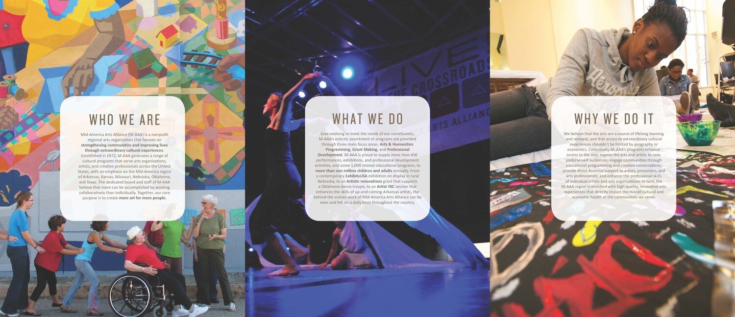
M-AAA lacked a standard ‘who we are, what we do’ brochure, so I created this with the launch of the new brand. The goal was to have great visual impact and brief content so that new people could easily. understand what M-AAA is about and what it does.

It’s easy to get lost in language and logistics. This was a refreshing piece to produce because it put M-AAA’s mission and purpose in easy to understand language with highly impactful visuals.
